Enhancing the user experience for a lifestyle app
Brief
tools
- Figma
- Figjam
- Google Suite
- Adobe Creative Suite
methods
- User testing
- Heuristic Evaluation
- Information Architecture Analysis
- Wireframing
the brief
I teamed up with a startup in the wellness industry to transform ZenLife—a beta app that offers eastern wellness practices like yoga, meditation, and kung-fu—into an intuitive, user-friendly experience. With just 10 days on the clock, my goal was to cut through the clutter and make the app feel as inviting and clear as the mindful practices it celebrates.
the challenge
ZenLife had been built with passion, but the founders were so immersed in perfecting every detail that they lost sight of the user’s perspective. When I first explored the beta, I found myself wandering through confusing menus and complex features—if I could get lost, so would the users. It was clear: the app needed a major usability tweak, starting with a fresh information architecture and a clearer design approach.
our approach
I started with a “hands-on user testing session.” I treated my first interaction with ZenLife as a genuine exploration, mapping out features and screens without any preconceived notions. From there, I zeroed in on one of the most critical aspects: the information architecture.
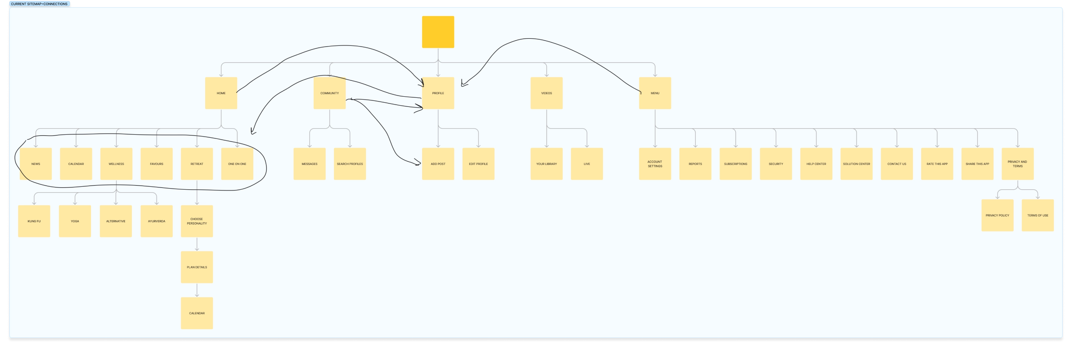
information architecture refresh
I began by sketching the app’s initial sitemap, which felt cluttered and overwhelming.
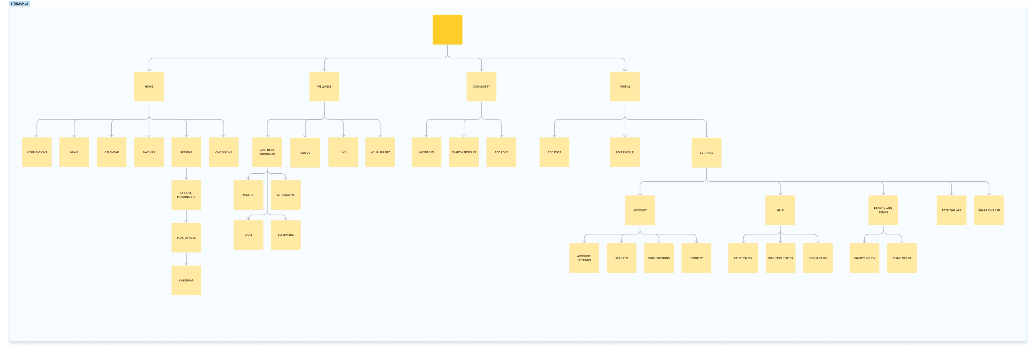
After researching best practices and analysing similar apps, I restructured the sitemap into a more intuitive, user-friendly flow.
redesign
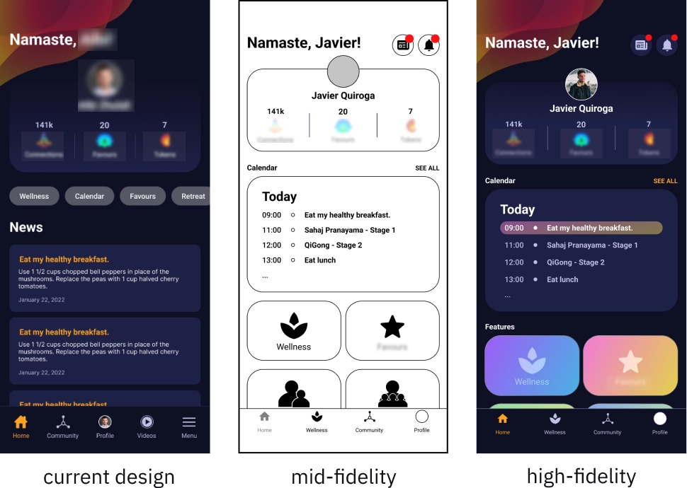
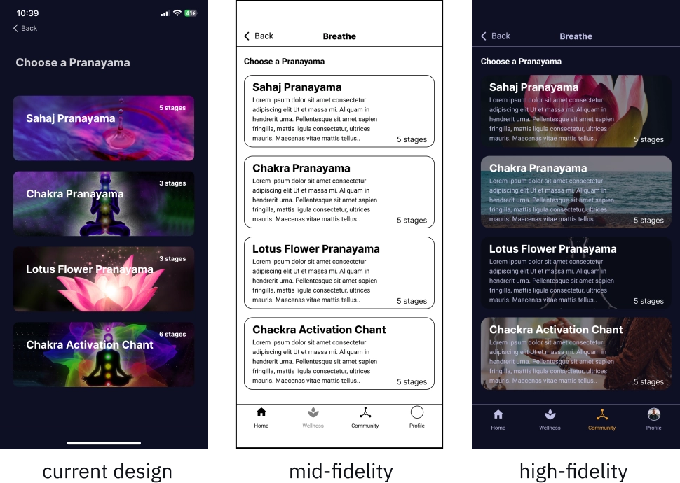
I iterated through a series of designs—moving from low-fidelity sketches to polished hi-fi screens—to breathe clarity and purpose into every key area of the app.
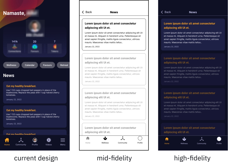
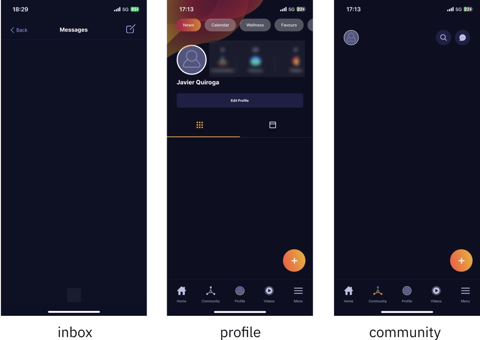
homepage
The homepage is the dashboard of ZenLife—it needs to provide a snapshot of your profile, calendar, and notifications at a glance. In the original design, news dominated the space while essential features were shoved into a secondary carousel. I flipped that around, giving key functions prime real estate and relegating news to its own dedicated page.
news
The news section now lives on a separate screen with a clear hierarchy: the latest article grabs your attention first, and once read, it fades out to keep the focus on what’s new.
wellness
Since wellness is the heart of ZenLife, I merged what were once separate “Videos” and “Wellness Services” into one cohesive Wellness section. It’s now organised into:
- Live: showing current and upcoming livestreams.
- Wellness Programs: complete with brief explanations to help users distinguish between different content types.
- Your Library: a dedicated space for your own lessons.
- Purchase More Classes: making it easy to expand your learning. I crafted a seamless, engaging flow for this section so that every wellness experience feels natural.
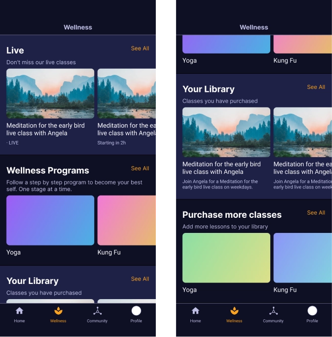
I added a brief explanation of the various sections within the Wellness Programs. This will allow users to make informed choices based on the information provided within the app, without the need for external research that might divert their attention away from the app.
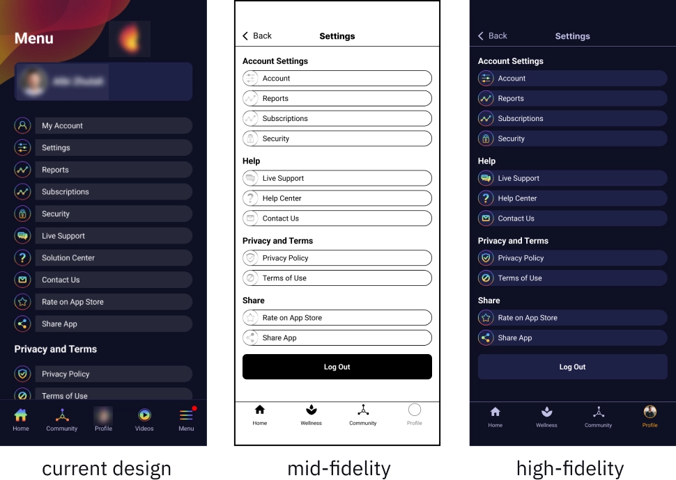
menu & settings
Originally, ZenLife featured a “Menu” with a hamburger icon that lumped together settings and other items—confusing and counterintuitive. I rebranded this as “Settings” and tucked it neatly into the profile. This change not only declutters the navbar but also mirrors familiar patterns seen in apps like Instagram and TikTok, making it easier for users to find what they need.
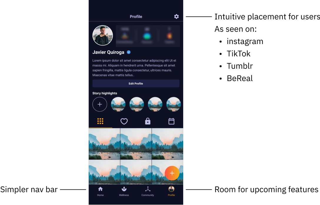
I divided the settings page into sections, making it easier for the user to quickly scan the screen and find what they're looking for.
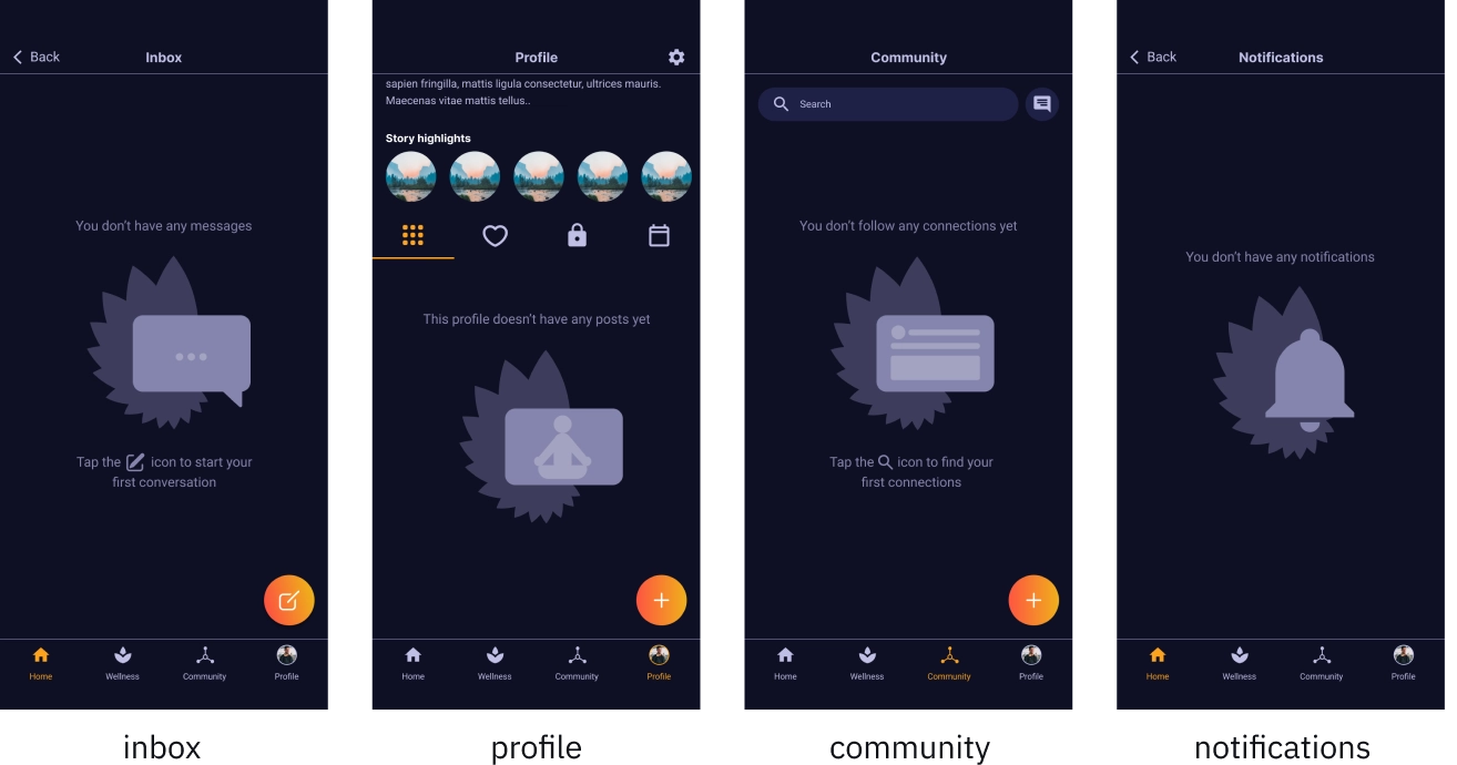
empty states
Blank screen can leave users feeling stranded, and in the version of ZenLife that I was first shown, there was a lot of them.
To address this, I designed thoughtful empty states with clear, friendly messages that guide users on what to do next.
retrospective
Convincing the client to embrace these changes wasn’t easy, but data-backed user testing made it undeniable. This project reinforced that while deep expertise is essential, keeping the user front and center is what truly drives a great experience. A refreshed information architecture paired with iterative, user-focused design not only simplifies the app—it elevates it.