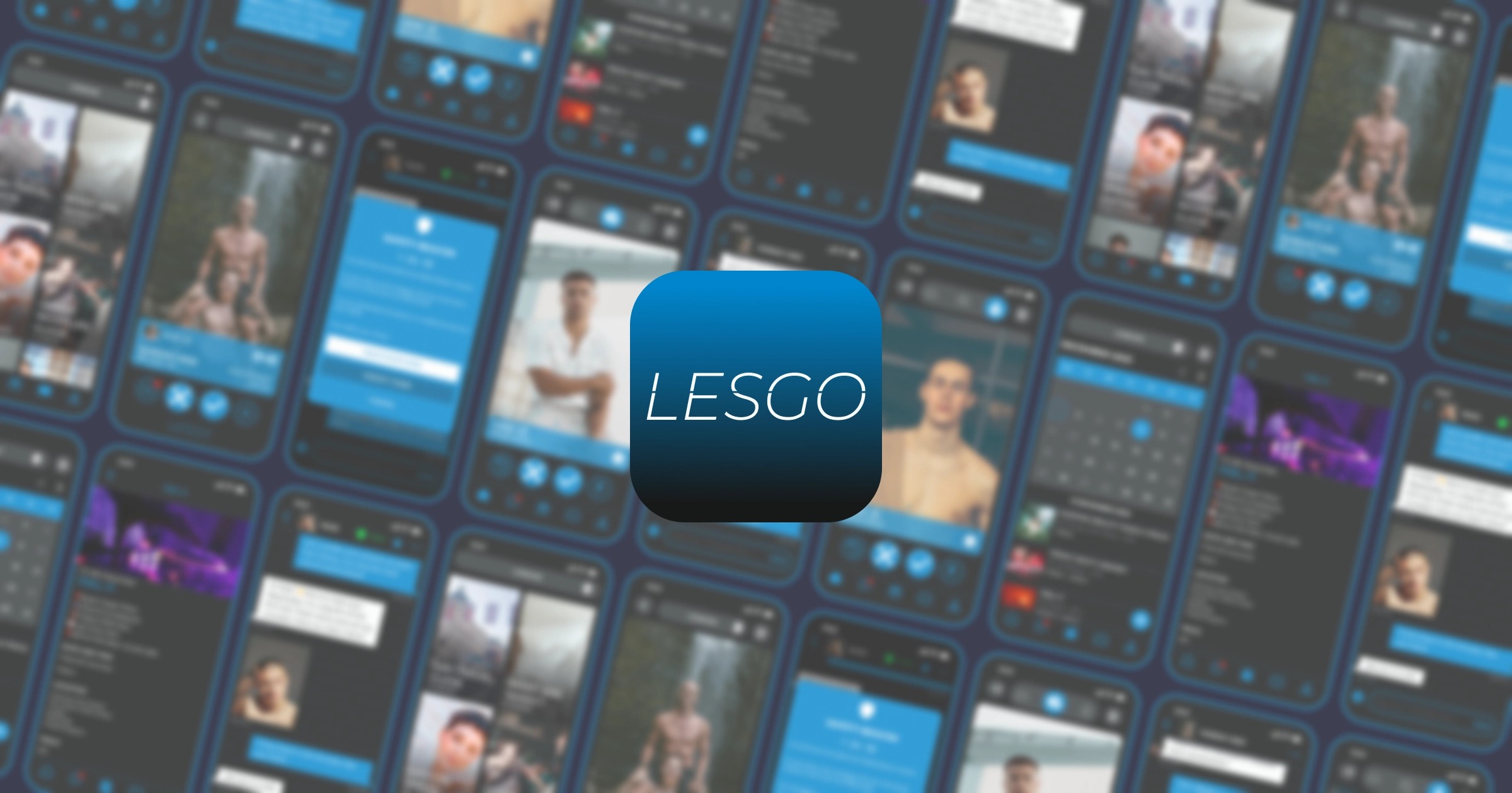
Refining LESGO: A UX Journey to Revitalize Queer Connections
Brief
tools
- Figma
- Figjam
- Adobe Creative Suite
methods
- User interviews
- Competitor Analysis
- Wireframing
primary target
- Men
- Late 20s - Early 30s
- London, UK
the client
LESGO is an Australian LGBTQIA+ dating app that lets you switch easily between friendship, dating, or casual swiping. With plans to break into the UK market, the app needed a design boost to attract a new audience while keeping its fun, inclusive spirit intact.
the challenge
Even though LESGO was built with heart, it hadn’t had the luxury of a true UX makeover. With the design managed by tight-budget teams and multitasking stakeholders, it ended up with a mismatched look, clunky navigation, and some accessibility oversights. In short, it was crying out for a “facelift.” I knew it was time to simplify interactions, tidy up the visuals, and make the whole experience feel as welcoming as the community it serves.
our approach
I dove in with a user-first mindset, determined to blend innovation with a nod to the app’s playful origins. The aim was clear: modernise the look and feel while smoothing out usability bumps—all without compromising its uniquely queer vibe.
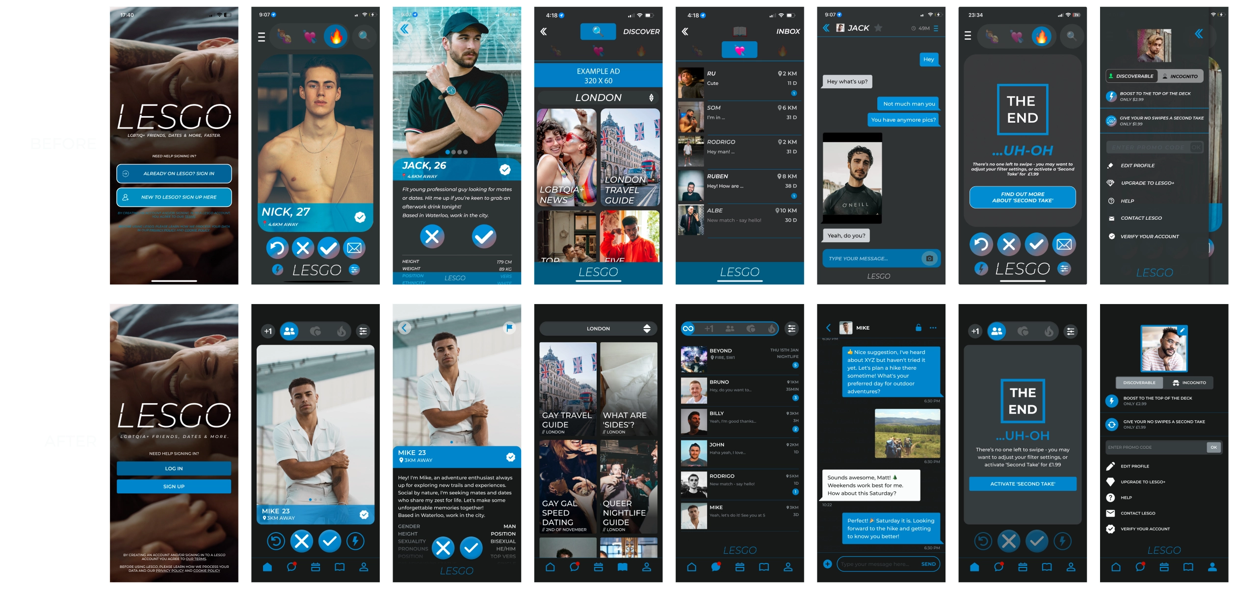
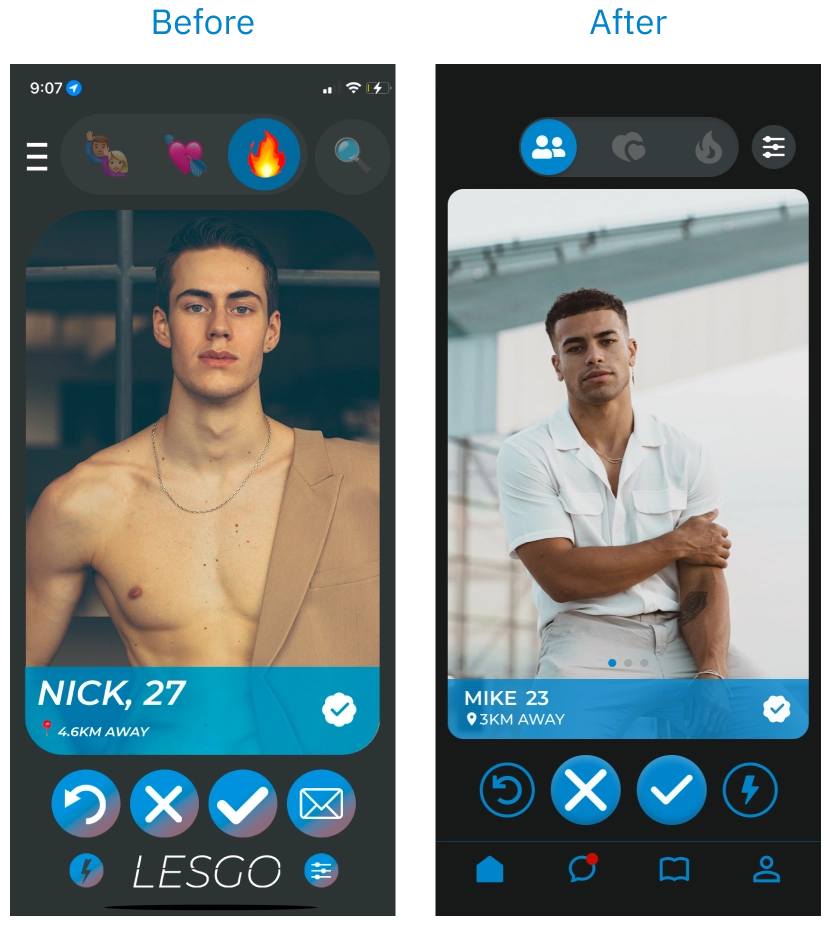
visual identity overhaul
first impressions
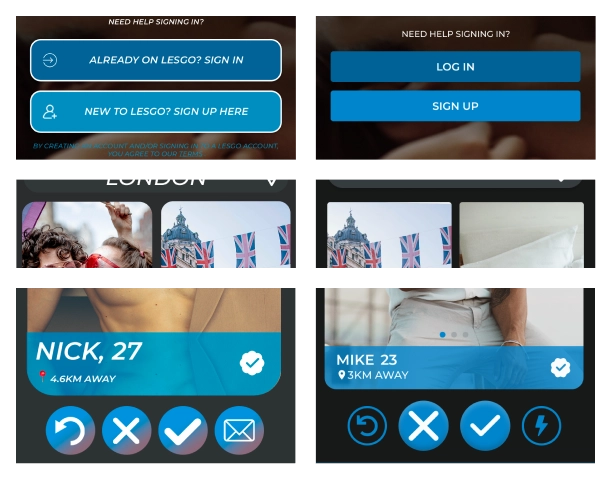
The initial design felt a bit disjointed—clashing colours, inconsistent icon choices, and random corner curves that didn’t add up.
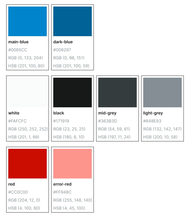
colour pop
I kept LESGO’s signature blue but refreshed the palette with bolder off-white and off-black tones, using subtle gradients to ease eye strain and keep things modern.
shape matters
I ditched the random rounded corners in favor of a deliberate system: a neat 4px radius for most elements, a comfortable 16px for swipe cards, and full roundness where it felt right.
typography & icons
Instead of a mix-and-match approach (hello, emoji overload!), I standardised the type and icons. Strong, clear titles paired with intuitive icons now quickly communicate each function.

navigation refresh
The original design tried to be minimalist, but that meant users were left guessing which button did what. To solve this, I introduced a straightforward navigation bar with four clear sections: Home, Messages, Explore, and Profile/Settings. This change not only cleared up confusion but also set the stage for future features.
user testing & iteration
Real users should always guide the process, so we put this into practice and tested our changes, focusing on particulars that we had doubts on:
Tested features
swiping clarity
They found the newly labeled swiping modes instantly understandable
finding your way
The updated navigation meant settings and features were now accessible in a snap.
icon wins
For the Explore section, testing showed that a magazine icon hit the mark, aligning perfectly with what users expected.
what's next
Feedback was overwhelming—in a good way. The “facelift” transformed LESGO into an app that’s not only visually fresh but also a breeze to use. And the journey doesn’t end here. New ideas are already on the horizon, like:
future features
safety beacon
A quick-tap feature to share your real-time location with a loved one when you need peace of mind.
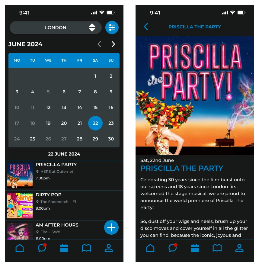
events calendar
A one-stop hub for all LGBTQIA+ friendly events
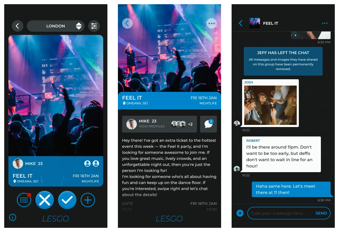
+1 feature
For those nights when you want company for a film, a show, or a night out.
lessons learned
Working on LESGO reminded me why I love the process of design. I almost jumped straight into prototyping, but taking the time to really talk to users and sketch out ideas made all the difference. Every conversation and little insight enriched the final product and taught me to trust—and enjoy—the journey every step of the way.