Revolutionising fibromyalgia management with Grinpath
Brief
time
- 10 days
team
- Beth Mac
- Curtis Ross
- Javier Quiroga
tools
- Figma
- Figjam
- Trello
- Procreate
the brief
Working on Grinpath was all about building a comprehensive solution for women with fibromyalgia. In just 10 days, alongside Beth Mac and Curtis Ross, we helped transform their MedTech app—designed to offer personalised behavioural activation and a gamified community—for a target audience of women aged 25 to 45. Our mission? Enhance quality of life and empower users by combining smart tech with genuine care.
the challenge
Grinpath’s founders had poured years into refining every feature, but they were so immersed that they lost sight of what users truly needed. When we first dove into the beta, we felt lost navigating its complex structure. Users, too, would struggle to access the valuable resources designed to support them. The app needed a radical rethink of its information architecture and user flow, ensuring that every interaction felt personal and empowering.
our assumptions
Right from the kickoff with Ale, Grinpath’s CTO, we laid out our assumptions to steer our research:
- Users crave personalized information that feels tailored to them.
- Real motivation comes when goals link to daily life.
- Users are more driven when they set their own goals.
- A lack of motivation (rather than a lack of desire) is the main barrier to treatment progress.
- Women over 45 are less likely to engage with an app designed for pain management.
research & insights
To validate our assumptions and truly understand our target users, we took a two-pronged approach.
secondary research
We dove into the digital world of fibromyalgia—reviewing online forums, social media chatter, and industry articles. Through this deep dive, we discovered that many women face misdiagnoses and a pervasive distrust of conventional medical advice. The complexity and variability of fibromyalgia symptoms underscore the urgent need for a supportive, user-friendly resource.
primary research
The real breakthrough came when we managed to interview several women living with chronic pain. Given the challenges of securing participants for such a sensitive topic, each conversation was gold. These interviews revealed that users aren’t lacking motivation—they’re craving genuine support and understanding. Their primary goal? To reclaim their quality of life so they can be present for their loved ones. They also expressed a deep desire for a community that offers empathy, shared experiences, and even a touch of humor—a stark contrast to the negative cycles common in many existing forums.
mapping the experience
creating linda
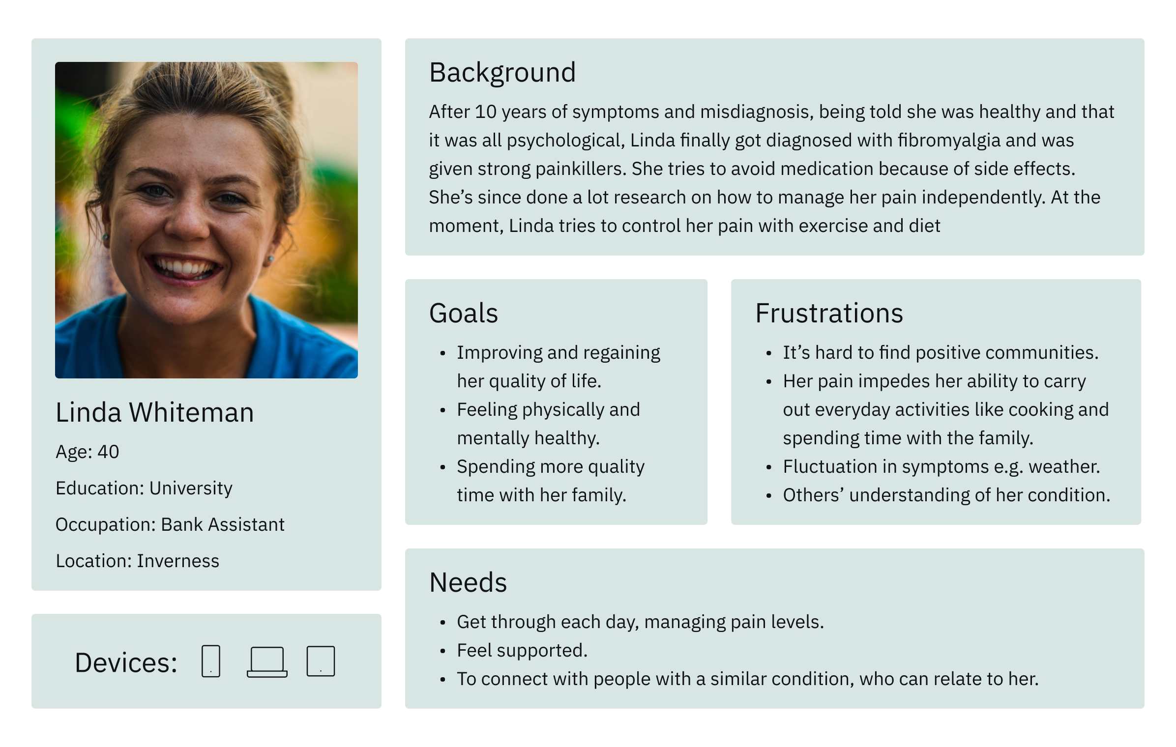
From these rich conversations, we synthesised our insights into a single, well-defined persona: Linda.
In UX design, a user persona is a fictional character that embodies the common traits, challenges, and aspirations of your target audience. Linda isn’t a real person, but her profile represents the typical experience of our users—struggling with isolation, chronic pain, and an overwhelming need for empathy and support.
Using Linda as our guiding light, every design decision was made with her needs in mind.
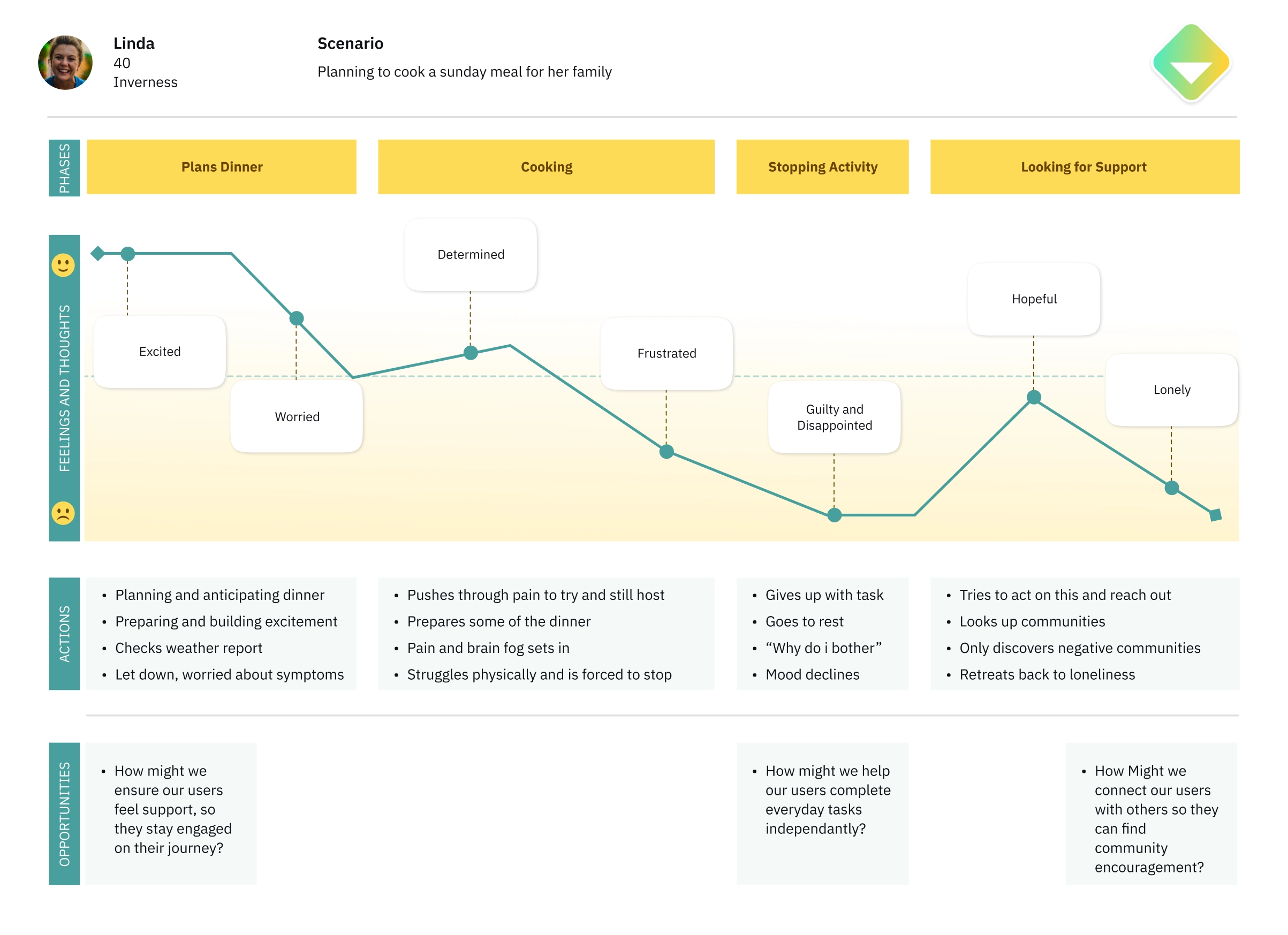
getting into linda's shoes
To further ground our design choices, we mapped out Linda’s journey. This exercise uncovered critical pain points—from moments of deep frustration to flashes of hope when she accessed a helpful resource. By turning these pain points into “How Might We…” opportunities, we reimagined a user experience that supports, empowers, and uplifts.
ideation & mvp
Armed with our research, we brainstormed ideas and prioritised them using the MOSCOW method. The must-haves quickly emerged:
- Allow users to set their own goals.
- Integrate a personalised behavioural activation program.
- Build a community platform that offers real support.
- Provide both reactive advice and proactive tips.
- Visualize progress in a clear, engaging way.
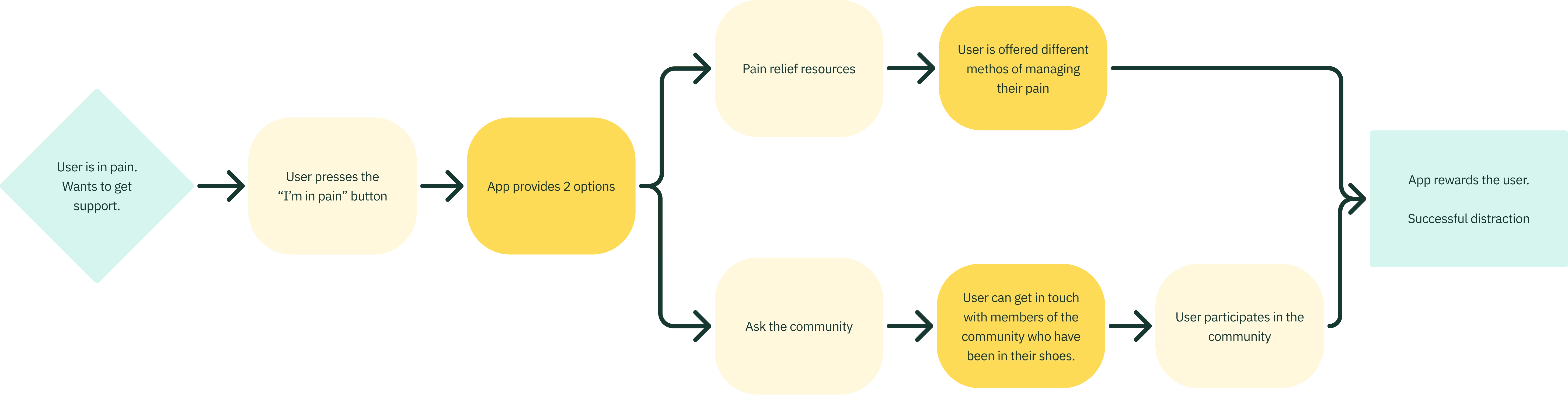
For our MVP, we focused on a transformative flow: when Linda is in pain, she taps an “I’m in pain” button and is presented with either a curated library of pain relief resources or an invitation to join a supportive community.
testing & iterating
low-fidelity & mid-fidelity wireframes
We began with quick sketches and low-fi wireframes, testing our ideas with users and our client. Their feedback led to subtle, yet essential tweaks—like enabling users to favourite a resource or fine-tuning profile details.
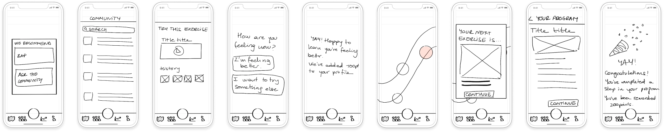
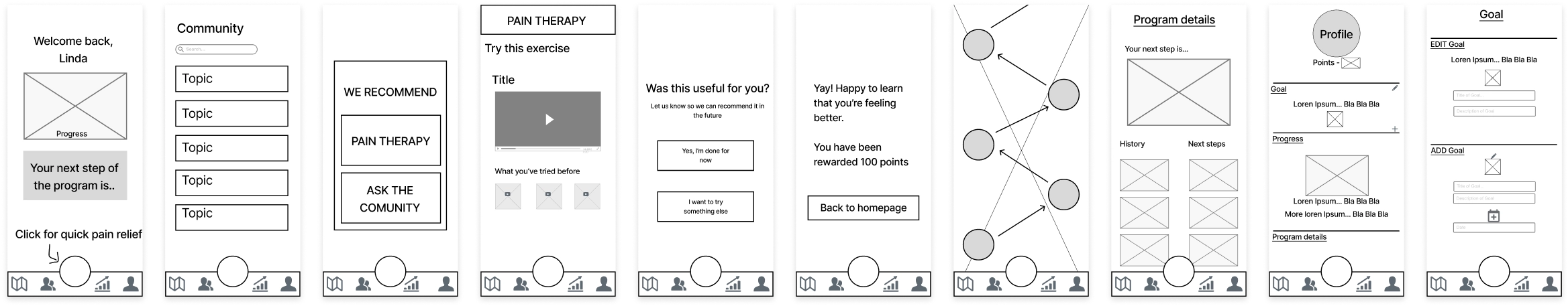
Transitioning into mid-fi prototypes, we refined the layouts and information placement to ensure a kind, straightforward flow that resonated with our users’ needs.
visual design & high fidelity
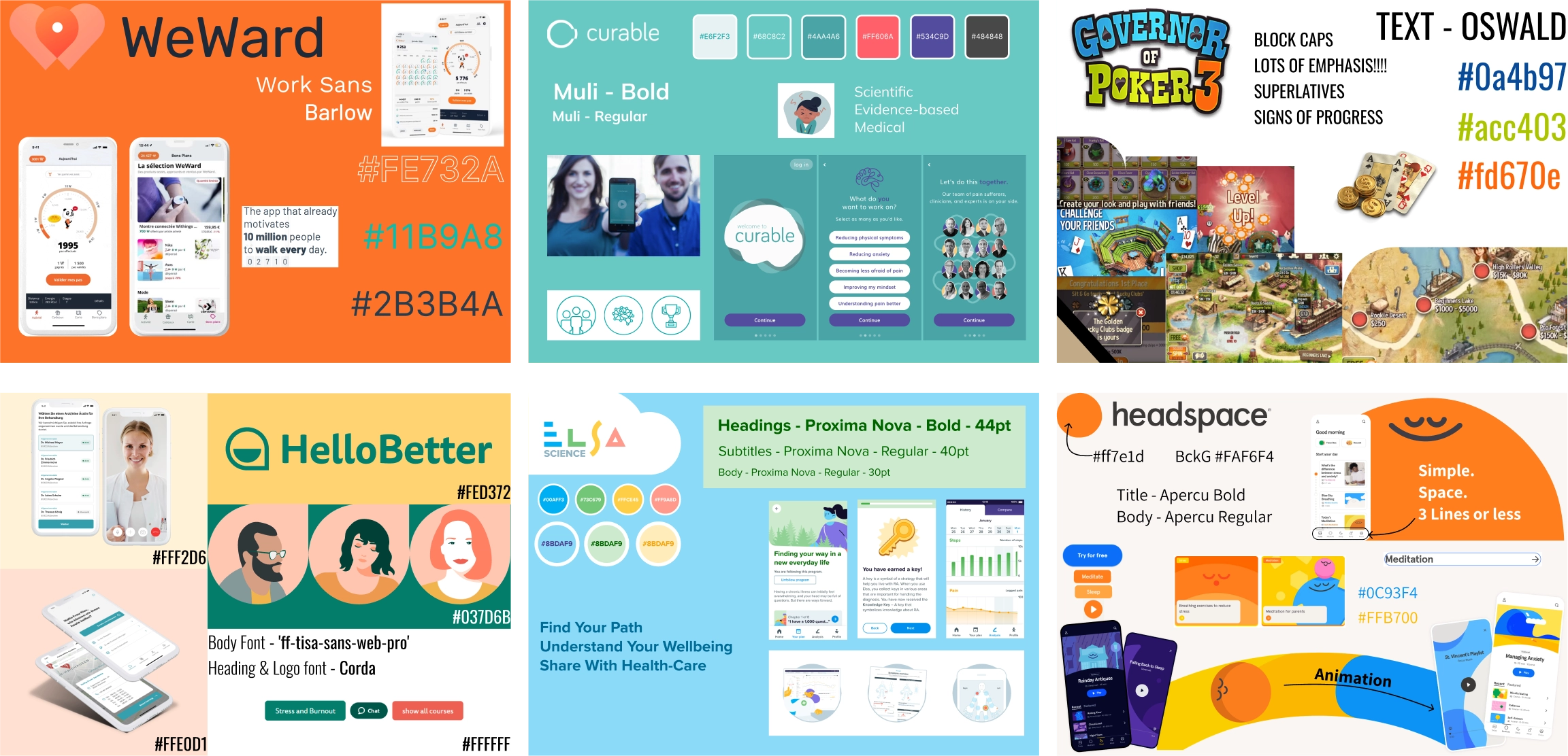
Before diving into final visuals, we conducted competitive analysis of existing pain management apps—drawing inspiration from platforms like Elsa, Curable, and even apps like Headspace.
Trends emerged: clean sans-serif fonts, soft pastel hues, minimalist illustrations, and rounded corners that evoke calmness.
mood board
We distilled these insights into a mood board centered on key adjectives: friendly, scientific, calm, supportive, and trustworthy. Our mood board wasn’t an arbitrary collage—it was guided by the language Ale used in our kickoff, ensuring Grinpath’s brand voice shone through.
colour & typography
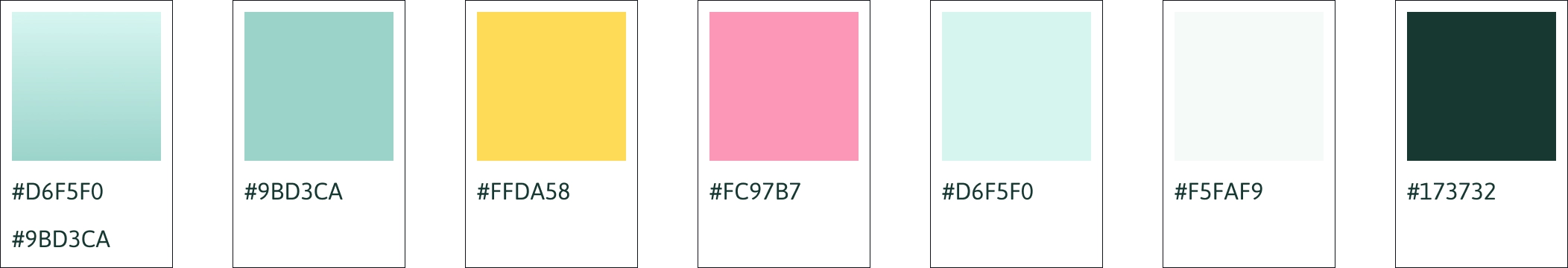
After testing over 30 colour options, we settled on a soothing triad palette that exudes support and trust while keeping a playful edge.
For typography, we kept Grinpath’s Barlow for bodies of text, but opted for Asap for headings, a typeface that injects a bit of fun without losing its reliability.
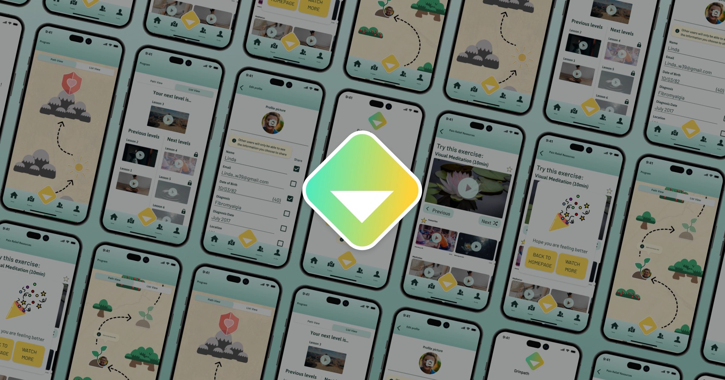
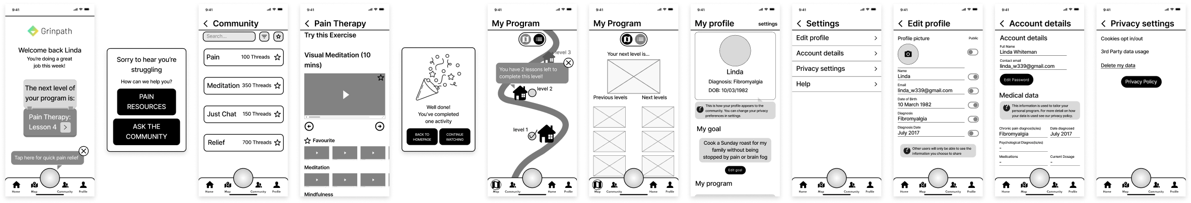
the final prototype
The final hi-fi prototype was built around two core paths
primary path
This path is based on our user flow, which focuses on providing immediate pain relief resources. This approach prioritizes simplicity, featuring prominent buttons and minimal options. Our goal is to ensure that Linda can quickly and easily access the help she needs when experiencing pain.
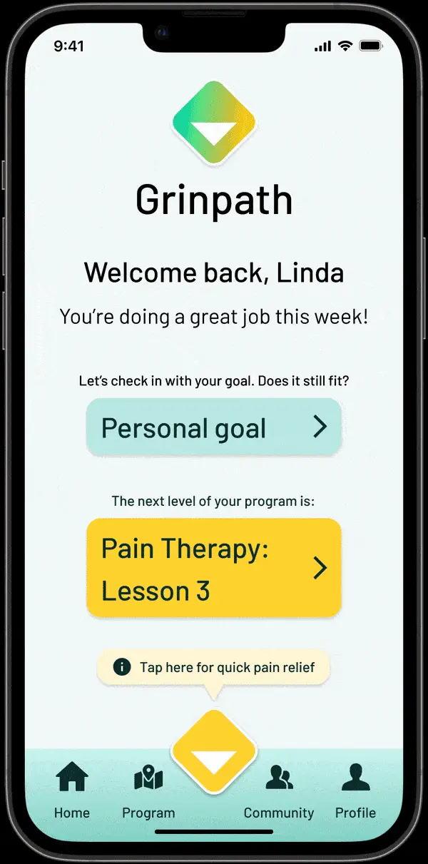
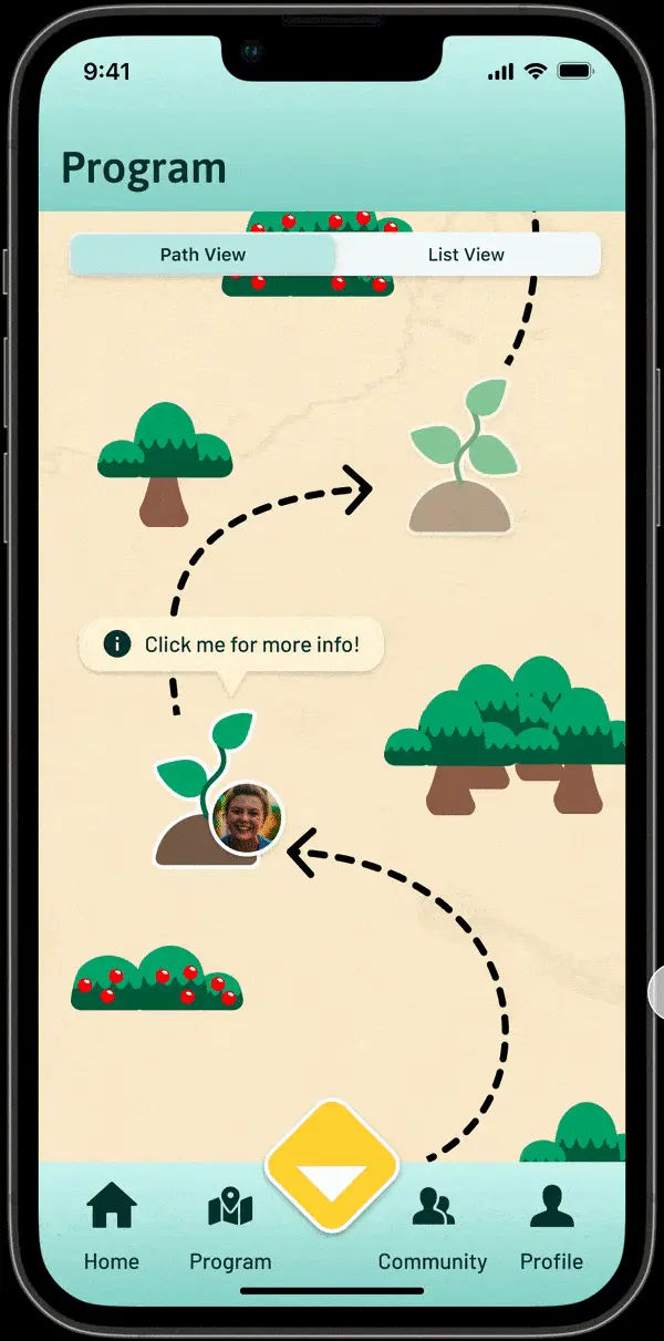
secondary path
Alternatively users can also explore Grinpath's personalised behavioural activation program. They have the option to view it as a map, allowing them to visualize their progress and future goals, or in a list view for a more straightforward approach, catering to users who prefer a non-game format.
next steps & retrospective
Time was tight, so we focused on delivering the MVP. Looking ahead, Grinpath envisions expanding the community space with a dedicated venting section, introducing a mentor system pairing experienced users with newcomers, and enhancing the behavioural activation program through closer collaboration with their medical team.
Reflecting on the project, securing interview participants was challenging and stretched our timeline—but every challenge taught us something invaluable. Given more time, I’d have loved to refine the hi-fi details even further. Working with Beth and Curtis was a true delight; their deep passion for UX pushed me to always strive for excellence.